Red Hat Marketplace brand guidelines
These guidelines are designed to help writers and designers create content and assets for Red Hat® Marketplace, a centralized location for trying, buying, and managing certified enterprise software for container-based environments in public clouds and on-premise.
Tone, voice, and strategy
At Red Hat, we want to be a technology company that stands out for our direct, honest, and reliable communications. Consistency across our web properties helps our audience understand what Red Hat stands for and what to expect from our content. Red Hat Marketplace is no different. Use Red Hat’s voice and tone, not IBM’s.
User experience
All Red Hat web properties follow Red Hat’s digital design system guidelines. When creating web elements like layouts, buttons, and links, follow these guidelines to ensure consistency across our web pages.
Logos
Available in both horizontal and stacked layouts, the Red Hat Marketplace logo follows the Red Hat universal logo format.
Logo and clear space
When using the logo, maintain clear space of at least the height of the letter "e" all the way around the logo. Clear space should be free from text, distracting graphics, and other logos.
Using the correct logo
The logo comes in three formats. The format you use for your project depends on the context and what you are promoting.
When promoting Red Hat Marketplace, always use the version of the logo with the "Operated by IBM" endorsement.
The Red Hat Marketplace logo without the "Operated by IBM" endorsement should only be used within the Marketplace interface. In this case, the IBM/Red Hat relationship is made clear in other areas of the interface.
Red Hat Marketplace Select uses the same logo structure and adds "Select" in a lighter weight font. It can be used with or without the IBM endorsement, but should only be used when promoting Red Hat Marketplace Select offerings.
Red Hat Marketplace logo in use
Use the Red Hat Marketplace logo as provided.
Do not rearrange parts of the logo.
Do not change the size of the IBM endorsement.
Do not add the IBM 8-bar logo to the Red Hat Marketplace logo.
Use the Red Hat Marketplace logo alone without other logos or branding.
Do not use additional Red Hat, IBM, or co-brand logos with the Red Hat Marketplace logo.
Do not co-brand the Red Hat Marketplace logo with another logo. Use the Red Hat or IBM logo instead.
Do not use the Red Hat Marketplace logo with a Red Hat business partner logo. Choose one.
Red Hat Marketplace partner buttons
Partners can use the "Available on Red Hat Marketplace" buttons to let customers know that a product is available on Red Hat Marketplace. These buttons can be used on web pages, promotional images, and other partner-branded materials to take users directly to Red Hat Marketplace.
Art direction
The overall feel of Red Hat Marketplace should be light and airy, with a focus on usability. Layouts should be simple and straightforward, with plenty of white space.
Color palette
Focus on light colors, like white and pale gray, with Red Hat red as an accent color. Use light grays as needed—for backgrounds, for example.
Color in the interface
For links and other interface elements, use colors from the Red Hat digital design system. These specific color values have been chosen to meet accessibility standards and should be consistent across Red Hat web properties.
Blues are a key part of the visual system but should come from illustrations, not from user interface (UI) or background elements.
Color in illustrations and marketing
Illustrations should be predominately light blues with dark blue and black shadows, plus Red Hat red as an accent color. Use illustrations in the interface to introduce shades of blue.
Typography
The words we choose are an important part of our voice, and so is the font we use. The way our words look reinforces the message they are communicating.
Red Hat Marketplace uses the Red Hat Display and Red Hat Text fonts used across the Red Hat brand. Use Red Hat Display for large text like headers and Red Hat Text for small text like quotes and body copy.
Illustrations
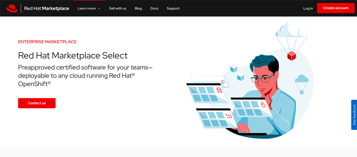
Use illustrations to add character, interest, and a human element to pages. Illustrations should tell a story and should complement and enhance the content they accompany.
Red Hat Marketplace illustrations use the Red Hat illustration style and focus on using shades of light blue and white. Dark blue, black, and limited pops of red are used to create shadows, contrast, and highlights.
Illustration elements
Use light blues to build a majority of the illustration. For objects in the scene, use shades of blue or black rather than realistic colors to create depth and shadows.
Use white to add details without cluttering the illustration.
Use Red Hat red for limited pops of color to highlight important parts of the illustration.
Use tints and shades of red and black for skin and hair. Illustrations should be inclusive of our diverse audience.
Use light blues and white with details in black and red for Red Hat Marketplace illustrations.
Do not use red or other Red Hat brand colors for a majority of the illustration. Use red for highlights and important details.
Do not use other colors from the Red Hat or IBM color palettes in Red Hat Marketplace illustrations.
Icons
Use icons in small spaces to illustrate concepts that don’t need a full illustration. Each Red Hat icon is designed to represent a specific concept so we can communicate consistently and effectively.
For large icons (30-100px), use the Red Hat standard icon library.
For smaller interface icons (less than 20px), use icons from the Carbon Design System.
Red Hat Marketplace brand in use
These elements come together to create a consistent brand and visual identity for Red Hat Marketplace that reflects the Red Hat brand. They can be used across applications beyond the website like advertisements, social media, and branded merchandise (swag).
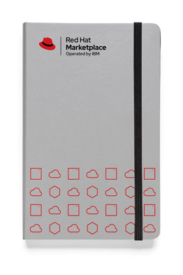
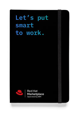
Swag should be simple and include the Red Hat Marketplace logo with the "Operated by IBM" endorsement.
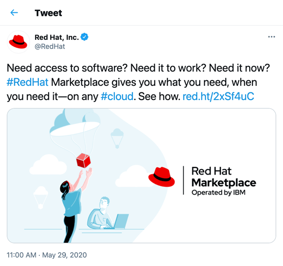
Social media posts should incorporate the Red Hat Marketplace logo with the "Operated by IBM" endorsement and utilize other elements of the visual system, like illustrations.
Use the Red Hat Marketplace logo with the "Operated by IBM" endorsement on swag.
Do not add Red Hat, IBM, or co-brand logos to swag items.
Use Red Hat’s design language in all applications.
Do not use IBM’s design language.


